An analysis of title cards and their fonts.
When watching visual media, title cards will likely be the first thing you see. They're very important since they help set the tone for the rest of the film, while also allowing audiences to understand what they are going to get into. Title cards have some sort of correlation with the rest of the film, they either match the aesthetics or provide a sneak peek. To be more specific, title cards are text-based frames in films that help display the title or other pieces of information, such as "based on a true story" or a time jump.
 |
| Emma. (2020) |
While having title cards in films is very important, something that is also important is to have a specific understanding of the use of font. Having a certain font chosen for films is crucial since it can significantly impact how audiences perceive the film, genre, mood, and period. Different genres of films use different characteristics for their fonts, for example, horror is more jagged and distorted.
 |
| It (2017) |
The film It (2017) has a specific font that is both haunting and intriguing, which helps emphasize the tones of fear and curiosity within the film.
 |
| Example of Star Wars merch |
For our film and genre, I believe that it is important we include more personal factors in the font. To tie in the coming-of-age genre, I feel that is important to have a handwritten font. This can draw in themes of youth and personal growth.
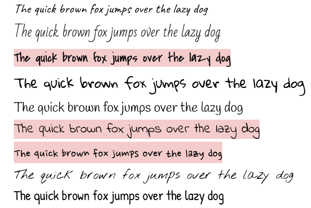
These are some potential fonts that we can use for our film. The highlighted ones are my favorites, but I believe that all of these fonts help emphasize our genre and our potential plotline.


No comments:
Post a Comment